
CSS radial-gradient() 函数
CSS radial-gradient 函数的作用是:创建一个由两种或多种颜色之间的渐变组成的图像。它的形状可以是圆形或椭圆形。函数的结果是 <gradient> 数据类型的对象,这是 <image> 的一种特殊类型。
实例
带有均匀间隔色标的径向渐变:
<!DOCTYPE html><html><head><style>#grad1 {height: 150px;width: 200px;background-image: radial-gradient(red, green, blue);}</style></head><body><h2>径向渐变-等间距颜色</h2><div id="grad1"></div><p><b>注释:</b>Internet Explorer 9 以及更早的版本不支持渐变。</p></body></html>
定义和用法
radius-gradient() 函数将径向渐变设置为背景图像。
径向渐变由其中心定义。
如需创建径向渐变,您必须定义至少两个色标。
径向渐变实例:
| 版本: | CSS3 |
|---|
浏览器支持
表格中的数字注明了完全支持该功能的首个浏览器版本。
-webkit-、-moz- 或 -o- 后面的数字表示使用前缀的首个版本。
| 函数 | |||||
|---|---|---|---|---|---|
| radial-gradient() | 26.010.0 -webkit- | 10.0 | 16.03.6 -moz- | 6.15.1 -webkit- | 12.111.6 -o- |
CSS 语法
background-image: radial-gradient(shape size at position, start-color, ..., last-color);
| 值 | 描述 |
|---|---|
| shape | 定义渐变的形状。 可能的值:
|
| size | 定义渐变的尺寸。 可能的值:
|
| position | 定义渐变的位置。默认值是 "center"。 |
| start-color, …, last-color | 色标是您要在其间呈现平滑过渡的颜色。该值由一个颜色值组成,其后是一个可选的停止位置(0% 到 100% 之间的百分比值,或沿渐变轴的长度值)。 |
更多实例
具有不同色标间距的径向渐变:
<!DOCTYPE html><html><head><style>#grad1 {height: 150px;width: 200px;background-image: radial-gradient(red 5%, green 15%, blue 60%);}</style></head><body><h2>Radial Gradient - Differently Spaced Color Stops</h2><div id="grad1"></div><p><b>注释:</b>Internet Explorer 9 以及更早的版本不支持渐变。</p></body></html>
圆形的径向渐变:
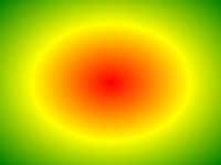
<!DOCTYPE html><html><head><style>#grad1 {height: 150px;width: 200px;background-image: radial-gradient(red, yellow, green);}#grad2 {height: 150px;width: 200px;background-image: radial-gradient(circle, red, yellow, green);}</style></head><body><h2>径向渐变 - 形状</h2><p><strong>椭圆(默认):</strong></p><div id="grad1"></div><p><strong>圆:</strong></p><div id="grad2"></div><p><b>注释:</b>Internet Explorer 9 以及更早的版本不支持渐变。</p></body></html>
使用不同 size 关键字的径向渐变:
<!DOCTYPE html><html><head><style>#grad1 {height: 150px;width: 150px;background-image: radial-gradient(closest-side at 60% 55%,blue,green,yellow,black);}#grad2 {height: 150px;width: 150px;background-image: radial-gradient(farthest-side at 60% 55%,blue,green,yellow,black);}#grad3 {height: 150px;width: 150px;background-image: radial-gradient(closest-corner at 60% 55%,blue,green,yellow,black);}#grad4 {height: 150px;width: 150px;background-image: radial-gradient(farthest-corner at 60% 55%,blue,green,yellow,black);}</style></head><body><h2>径向渐变-使用不同的 size 关键字</h2><p><strong>closest-side:</strong></p><div id="grad1"></div><p><strong>farthest-side:</strong></p><div id="grad2"></div><p><strong>closest-corner:</strong></p><div id="grad3"></div><p><strong>farthest-corner (this is default):</strong></p><div id="grad4"></div><p><b>注释:</b>Internet Explorer 9 以及更早的版本不支持渐变。</p></body></html>
相关页面
CSS3 教程:CSS3 径向渐变